
In the digital landscape, first impressions are often visual. Before a user reads a word of content or interacts with a button, their eyes process color, layout, and imagery. Among these visual components, color plays a crucial psychological role in shaping perceptions, influencing decisions, and guiding user behavior. This is where color psychology comes into play—a powerful element that every skilled website design agency understands and utilizes to craft impactful digital experiences.
Understanding Color Psychology
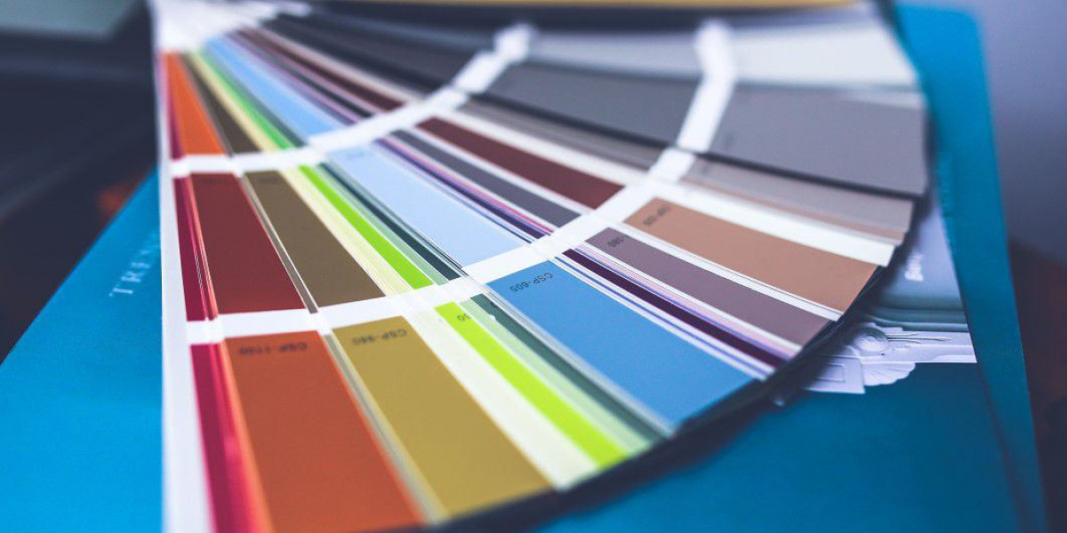
Color psychology is the study of how colors influence human emotions and behaviors. Different colors can evoke different reactions, and these reactions can vary based on personal experiences, cultural background, and context. In web design, color psychology helps guide decisions about branding, layout, call-to-action buttons, and even the emotional tone of a website.
For example, red can convey urgency, passion, or excitement, while blue is often associated with trust, calmness, and professionalism. These associations aren't just abstract theories—they are backed by behavioral studies and marketing experiments that demonstrate how color affects consumer choices.
Why Color Psychology Matters in Web Design
In web design, color isn’t just about aesthetics—it’s about communication and conversion. A thoughtful color palette can increase user engagement, boost conversions, and enhance the overall user experience. On the other hand, poor color choices can create confusion, lower credibility, and even drive visitors away.
A professional website design agency understands that color usage must align with the brand's identity and goals. Whether the aim is to build trust, evoke emotion, or guide users toward a specific action, color is a powerful tool to make that happen.
Enhancing Brand Identity
Colors are integral to a brand’s identity. Think about how recognizable Coca-Cola’s red or Facebook’s blue have become. A website design agency will often start by understanding the brand’s core values and then select a color scheme that reflects those values. For example:
Green is frequently used by eco-friendly brands or those emphasizing health and nature.
Purple is often associated with luxury, creativity, and sophistication.
Orange conveys energy, enthusiasm, and affordability.
By aligning web design colors with brand personality, agencies create a cohesive and memorable online presence.
Driving User Engagement
Color choices directly impact how users interact with a website. Call-to-action (CTA) buttons, navigation menus, and banners rely heavily on color to stand out. For example:
A bright red CTA button might encourage users to click due to its association with urgency.
A calming blue background may increase session duration by making the user feel relaxed and comfortable.
A contrasting accent color can guide users’ eyes to important content or pathways on the site.
By leveraging color psychology, a skilled website design agency can subtly direct user behavior and enhance interaction without overwhelming the user.
Cultural and Emotional Considerations
While color psychology provides useful generalizations, it's also important to understand that color perceptions are not universal. Cultural context plays a significant role in how colors are interpreted:
In Western cultures, white is often seen as pure and clean, while in some Eastern cultures, white can be associated with mourning.
Red in China is associated with prosperity and celebration, while in other cultures it might signal danger or warning.
An experienced website design agency will always consider the cultural demographics of its client’s audience when choosing colors. Global brands especially must be cautious to ensure their websites resonate positively across different markets.
The Science Behind Conversion Rates
Numerous studies have shown that color can significantly influence website conversion rates. According to research from the Institute for Color Research, people make a subconscious judgment about a product within 90 seconds, and up to 90% of that assessment is based on color alone.
Some real-world examples include:
Performable, a software company, changed its CTA button from green to red and saw a 21% increase in conversions.
HubSpot discovered that different audiences responded better to different colors based on their emotional resonance and visibility.
A professional website design agency will A/B test different color variations to determine which combinations yield the best performance, rather than relying solely on design trends.
Best Practices for Using Color Psychology in Web Design
1. Start with the Brand's Core Message
Colors should support the brand's story and values. For a financial institution, blue might instill trust. For a children’s brand, bright primary colors can foster fun and playfulness.
2. Limit the Color Palette
Too many colors can overwhelm and distract users. Most successful websites use a primary, secondary, and accent color to maintain visual consistency.
3. Ensure Accessibility
Color choices must consider visual impairments such as color blindness. A good website design agency uses tools to ensure sufficient contrast and incorporates alternative indicators for key actions (e.g., underlining links in addition to color).
4. Use Color to Guide Navigation
Colors can indicate different states or sections on a site. For instance, a change in button color on hover provides feedback that it's clickable. A consistent color scheme across menu items helps users intuitively navigate.
5. Test and Analyze
What works for one brand may not work for another. A data-driven website design agency will use A/B testing, heatmaps, and user feedback to refine color choices for optimal performance.
Case Study: Color Psychology in Action
Consider an e-commerce site selling fitness apparel. The brand aims to be energetic, empowering, and modern. A website design agency may use:
Red or orange for call-to-action buttons to invoke urgency and excitement.
Black and white product backgrounds to create a sleek, clean feel.
Green accents in checkout pages to signal success and safety.
After analyzing user behavior, the agency might find that a red CTA button converts better than orange, leading to subtle but impactful design tweaks that improve sales.
The Role of Professional Expertise
While basic knowledge of color psychology is accessible, implementing it effectively in web design requires expertise and strategic thinking. A seasoned website design agency brings a multidisciplinary approach—combining psychology, design principles, branding, and analytics—to ensure that color choices are purposeful and effective.
Moreover, these agencies stay up to date with evolving trends and user expectations. For example, pastel shades and muted palettes are gaining popularity in 2025 as users seek more calming digital experiences. An in-house team or DIY designer may miss these nuanced shifts, but a dedicated agency is equipped to adapt and evolve designs accordingly.
Final Thoughts
In the competitive online world, color is more than just a visual element—it’s a strategic tool. When used thoughtfully, it communicates messages, evokes emotions, builds trust, and drives action. Whether it’s choosing the right hue for a call-to-action button or developing an entire color system for a brand, understanding and applying color psychology is essential.
Partnering with an experienced website design agency can make all the difference. These professionals know how to translate brand identity into compelling visuals that resonate with users and support business goals. By leveraging the science of color psychology, businesses can turn casual browsers into loyal customers and deliver a digital experience that truly stands out.