
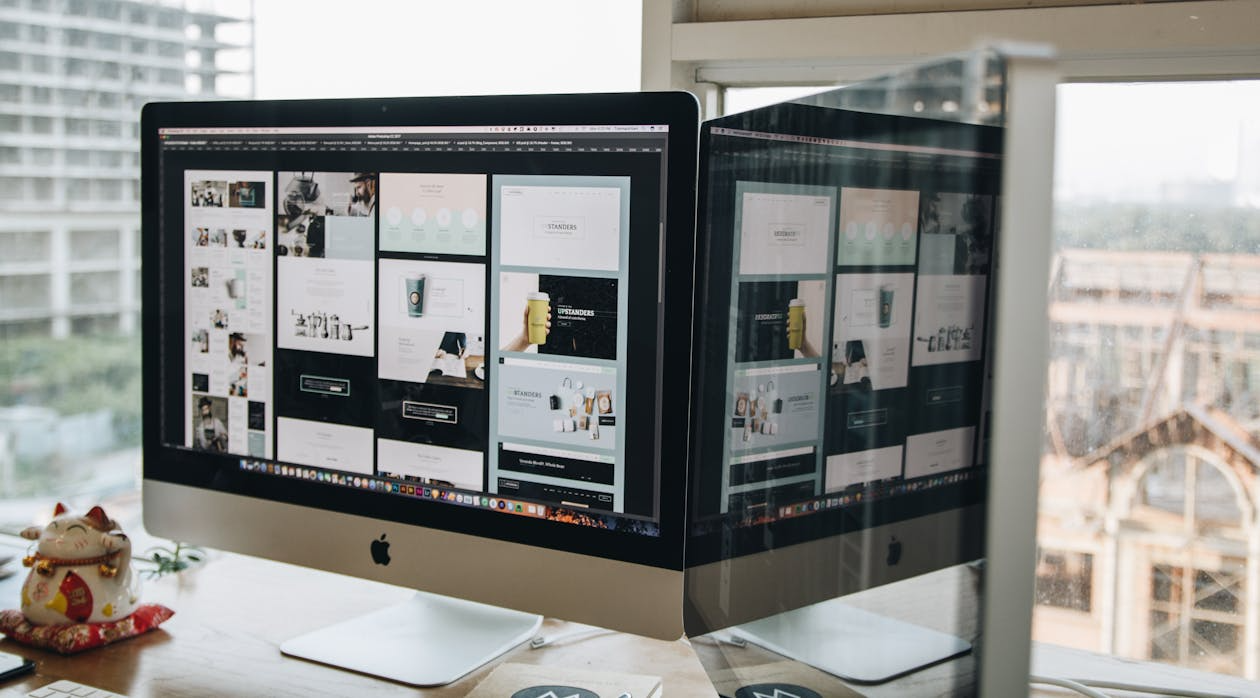
Top 8 Principles of Effective Web Design
These days, it’s rare to find a business without a website. But if you’ve spent any time online, you’ve probably noticed that not all websites are created equal. Some are quick to load, simple to navigate, and just feel more enjoyable to use. That’s the result of thoughtful, effective web design, and it plays a huge role in shaping a user’s experience.
Good web design isn’t just about how a site looks. It’s also about how it works. A beautiful layout means little if users struggle to find what they’re looking for or leave the site in frustration. Poor design often leads to disappointing performance, reflected in metrics like high bounce rates, short visit times, and low conversions.
So what exactly makes a website work well? In this article, we’ll break down 8 key principles of web design that can help you create a site that’s not only visually appealing but also functional, user-friendly, and results-driven.
1. Clear Purpose
A great website starts with a clear purpose. Every page should exist for a reason, whether it’s to inform, entertain, prompt an action, or complete a transaction.
When designers build with intention, they ensure that each section of a site serves the needs of its visitors. This kind of clarity keeps users focused and engaged. On the flip side, when a website is cluttered with too many elements or tries to do too much at once, it can quickly become overwhelming. Simplicity and direction go a long way toward a smoother user journey.
2. Keep it Simple
Simplicity is at the heart of good web design. The more straightforward the site, the easier it is for users to get where they need to go, whether that’s making a purchase, reading content, or filling out a form.
Here’s why simplicity works:
-
Ease of Use: A clean design helps users find information faster and with less effort.
-
Faster Load Times: Minimalist layouts and optimised images mean quicker loading speeds, which leads to better performance and higher conversion rates.
-
Mobile-Friendly: With mobile usage surpassing desktop, responsive design is a must. Simple layouts adapt better to all screen sizes.
-
Better Communication: A clear structure helps convey your message effectively. Visitors shouldn’t need to dig around to figure out what you offer.
At the end of the day, a simple website creates a better overall experience for the user, and that’s what keeps them coming back.
3. Visual Hierarchy
Design isn’t just about making things look good; it’s about guiding the eye. Through size, colour, spacing, and contrast, a strong visual hierarchy helps users understand where to look and what to focus on.
Think of it like a map for the eyes: Headlines should stand out, buttons should be noticeable, and information should flow in a way that feels natural. Breaking up large blocks of text with spacing or images also helps make content easier to read.
When done right, visual hierarchy not only improves usability but also strengthens your branding. Consistent use of fonts, colours, and layout across the site builds familiarity and trust with your audience.
4. Intuitive Navigation
Navigation is one of the most important parts of any website. If users can’t find what they’re looking for quickly, they’ll likely leave and may not come back.
Good navigation helps in three major ways:
-
User Experience: Menus and links should feel natural. If a user has to click more than a few times to get to a key page, the site needs restructuring.
-
Customer Retention: Easy navigation leads to satisfied users, and satisfied users are more likely to return.
-
SEO Benefits: Search engines prefer websites with a clean, logical structure. Properly labelled menus and internal links help bots understand your site and rank it appropriately.
Whether you’re designing a simple one-page site or a large e-commerce platform, make sure your navigation is user-focused and organised.
5. Meaningful Content
A beautiful design can grab attention, but it’s the content that keeps visitors interested. Great web content is informative, engaging, and aligned with your brand’s goals.
Here’s why content matters:
-
Search Visibility: Regularly updated, keyword-rich content helps your site rank higher in search engines.
-
Building Trust: High-quality writing builds credibility and demonstrates expertise.
-
Authority: Thoughtful blog posts, FAQs, and educational resources can position your business as a leader in its field.
-
Shareability: Good content gets shared, expanding your reach and bringing in new visitors.
-
Conversion Power: Strategic messaging and strong calls to action (like “Sign up now” or “Get a free quote”) guide users toward taking the next step.
In short, content is the foundation of your site’s message, and when paired with strong design, it becomes a powerful tool for growing your business.
6. Typography
Typography is more than just choosing a good-looking font—it’s about how your words are presented and how easily they can be understood. The typefaces you choose, along with their size, weight, and color, play a big role in both usability and branding.
Here’s why typography matters:
-
Readability Comes First: If users can’t read the text easily, they won’t stick around. Choose clean, legible fonts that match your brand’s tone and make reading effortless on all devices.
-
Brand Identity: Typography helps shape how your brand is perceived. A sleek, modern font gives a different impression than one that’s playful or traditional. Consistently using your chosen fonts across all pages helps reinforce that identity.
-
Clear Communication: Fonts subtly convey mood and tone. Before users even read the words, typography can suggest whether your brand is professional, casual, innovative, or trustworthy.
-
Visual Hierarchy: Differentiating headings, subheadings, and body text with font sizes and styles creates structure. It helps users navigate the content more naturally and improves overall user experience.
-
Consistency: Once you've chosen your font styles and formatting, use them consistently. Uniform typography across your website (and all branded materials) builds familiarity and trust.
Typography may seem like a small detail, but it has a big impact. It guides users through your content and reinforces your brand message every step of the way.
7. Colour
Colour is a powerful design tool that can immediately influence how users feel when they land on your site. It sets the tone, communicates your brand personality, and even affects how users behave.
Here’s how colour works in web design:
-
Emotional Impact: Different colours evoke different emotions. Warm colours like red or orange create energy and urgency, while cooler tones like blue and green feel calm and trustworthy. Choosing the right combination helps communicate your message more effectively.
-
Readability Through Contrast: Colours also affect usability. Low contrast between text and background can make your content hard to read. High contrast, like black text on a white background, makes everything clearer and easier to scan.
-
Navigation Cues: Using colour to highlight buttons, links, or menu items helps guide users through your site. It also helps reinforce visual hierarchy and improves interaction.
-
Consistency and Brand Identity: Stick to a defined colour palette that reflects your brand. Repeating the same colours throughout your site creates a cohesive and professional look.
When used wisely, colour does more than make your site look good—it shapes the overall user experience and strengthens your visual branding.
8. Mobile-Friendly Design
These days, most people browse the internet on their phones. That’s why mobile-friendly design isn’t optional anymore; it’s essential.
To ensure your site works well on smartphones and tablets:
-
Use Responsive Design: This approach allows your website to automatically adjust to any screen size, providing a smooth experience whether someone is on a phone, tablet, or desktop.
-
Optimise Layouts for Smaller Screens: Touch-friendly buttons, easy-to-read text, and simplified menus are all key elements of good mobile UX.
-
Improve Load Speeds: Mobile users are often on slower connections, so optimising images and reducing unnecessary elements will help your site load faster.
-
Boost Your SEO: Google prioritises mobile-friendly sites in its search results. If your website isn’t responsive, it may struggle to rank well.
In short, designing with mobile users in mind means creating a smoother, faster, and more enjoyable experience for your audience, no matter what device they’re using.
Comments
0 comment